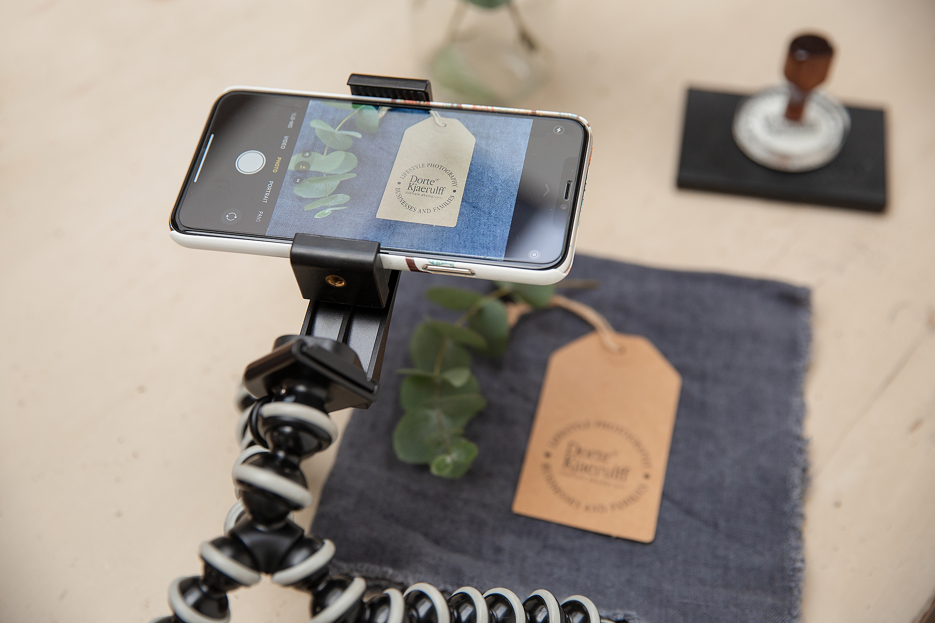
Before you shoot 100 images, just pause and consider the aim for those images. It’s no good having your content all worked out, and the image ready to go, and then realise that once the image has been cropped to fit the space, it total doesn’t work anymore!
Always work with the end use in mind. And don’t just think about today and tomorrow, think ahead, what use might be coming up later in the year! You might think the pictures is just for Instagram today, but could it be picked up by anyone who would need it printing, maybe in a magazine?
Here are a couple of things to consider when planning your visual content. This goes for both still images and video.
Instagram
It obviously needs to crop nicely to a square format. If this hasn’t worked out for you, a plan B is to make a broad border.
Instagram stories
You will find that portrait images works best. As a plan B, do you know that you can change the background colour to your brand colour, if you are using a landscape image?
Web banner
Website images are usually quite broad, especially for the format you get on a phone. You will need to create landscape images, that will be ok with a bit of either the top or bottom cropped to fit the large wide space.
Facebook banner
This is an even more extreme version of the web banner. It is very wide and narrow space, and very often you go to use an image just to find that you have lost everyone’s heads. If you are creating an image specifically, make sure you have the important elements lined up across the middle. If you have important elements both at the top of the frame and at the bottom of the image, you will end up loosing part of your message. Also note, the Facebook banner has a different dimension on a phone compared to a PC.
Printed materials
If you are being featured in a printed magazine, ask what size images they will need and make sure you send them high resolution images, so they will print in great quality.
Selling online
If you are selling online, for example on Etsy, eBay, notonthehighstreet etc there are often guidelines for the size and quality of the images needed. They might even tell you the colours of the backgrounds, and how much text you can use etc. Always check before hand, so you don’t waste your time. Often they will require more than one image per product. Some time a site will dictate only white background images, sometimes they only want lifestyle images.
Third party
Are you being featured on someone else’s podcast, or speaking at an event? They will often have a set format for the graphics used to promote events, and your images will need to fit that space. Check far in advance, so you don’t find your self faced with a “tonight” deadline for a picture you haven’t got.
Text
Will you want to add text to your image? In which case make sure you leave some empty space either on the side or top/bottom. You will get a much calm and planned look, compared to forcing text over a busy image.
Maximize
And finally, make sure you maximize every set up! Take a big picture, a close of image and a variation with empty space for text. You might want to take a portrait version as well as a landscape version and that way you have covered all events.
Remember, you will not always be able to shoot the needed format, so often we shoot something, knowing that we will be cropping it later.
You can find out more about planning your visual content here.


0 Comments